
INFORMATION ARCHITECTURE • RESPONSIVE WEB DESIGN • UX RESEARCH • UX DESIGN
GLSEN
Bringing peace, relief, and security to LGBTQ+ students and parents through accessible therapy and rights awareness.
My Roles and Responsibilities
User Research: Surveys, Interviews, Persona, Journey Mapping, Competitor Analysis, Card Sort Analysis, Tree Testing
UX Design: Solution Ideation, Wireframes, Lo-Fi Prototypes, Usability Testing, Hi-Fi Prototypes
Duration
12 Weeks
Team Members
Scott Dunay
Alysha Leonard
Laiba Sarwar
Tools
Optimal Workshop
Figma
FigJam
Miro
This project was completed as a part of INFO 643 – Information Architecture and Interaction Design, a core class at Pratt Institute’s Information Experience Design Program. Students were divided into a group of three or four and were presented with a conceptual brief from GLSEN.
GLSEN is an organization founded by a group of teachers in 1990. It serves to provide an affirming learning environment for LGBTQ+ youth and conduct research to provide evidence-based solutions for K-12 education. GLSEN works to ensure that LGBTQ students are able to learn and grow in a school environment free from bullying and harassment.
Problem
GLSEN, as our client, was wanting to introduce a page specifically for parents of LGBTQ+ students to feel confident about their child’s safety and the resources available to them at school.
How do we help parents of LGBTQ+ students feel secure about the resources they need to support their child’s education and journey?
Solution
Our Approach

Key Insights
Through interviews and surveys, we found out that the first thing parents looked for when their child came out were resources to calm their child.
Parents want their children to feel confident about their identity and make them feel confident about their future.
Communities were the most suggested and sought after by both parents and LGBTQ+ students.
We noticed two key themes:
Emotional Support
The Need For Community
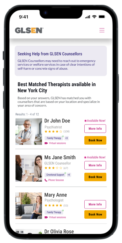
The very first iteration of this webpage only had the names and pictures of the therapists and a brief overview of their modes of session. I realised that this information may be too little for a potential client to click over, hence I conducted secondary research and launched a quick survey which was answered by 10 participants.
Through secondary research, I found out that nearly 73% of clients look for their therapist’s professional experience followed by their CV and Professional Development (67%) and recommendations and criticisms (62.2%).
The survey I launched in Google Forms provided me with insights into what I could do to make the therapist as informative as possible for the client to be interested in moving further. I found out that 70% of the respondents would select a therapist based on their availability, followed by their specialization (60%), mode of sessions, location and client’s comfort level (50%).
I addressed these needs in the latest iteration with signifiers showing availability as well as their areas of expertise.

Persona

Design
Our initial focus was to create a dedicated section for parents, considering the sensitivity of the 'coming out' topic.
Sub-categories were added to this section, offering resources that parents might seek.
Major Ideas, Decisions, Critiques and Iterations
Major Changes to The Existing Website + Navigation
We decided to add the crisis hotline button in the top navigation bar to make it more visible and prevent long scrolls towards the footer in time-sensitive cases. We also made necessary changes to the navigation from our card sorting and tree-testing observations from Optimal Workshop.
We decided to remove the sticky ‘Donate’ button on the screen which interfered with mobile users trying to navigate the website.
Iterations for Finding the ‘Right’ Therapist

Find Communities Nearby Easily
Donate With Confidence!
Other Recommendations
Final Product
Style Guide
FROM FIGMA
We decided to keep the original colour scheme of GLSEN.org to preserve the branding of the organization and have consistency for the final product.
Reflections
WHAT I COULD DO DIFFERENTLY AND WHAT DID I LEARN?
This was my first UX project, and while the focus was more on information architecture, I made it a point to challenge myself and make the most out of this learning process. I was also very lucky to be able to participate in the end-semester critique of the project which gave me a chance to take a step back, breathe and look at my decisions again, providing me more chances to improve myself.
The Sensitivity of The Matter: The topic was very sensitive to discuss for some. Despite the survey form being confidential, we had a very hard time following up with parents. Recruiting participants was the most challenging part.
Adaptability to sudden changes: We started as a team of five however, one of us had to leave and move to a different team due to the team member limit for our class. This led to a very important member moving to a different team. We had to adapt to this change by adjusting and learning the requirements of different UX roles.
Critiques are necessary: The therapy page being introduced as a part of the parent section received a lot of mixed reviews. I realized that it would be much better to make it accessible with a call to action button, prompting the distressed, user to reach out for help immediately. This would lead to students' stress benefiting from this service directly rather than having a parent book a therapy for them, or them going to the bed and section and booking the treatment.
A future opportunity for GLSEN: We also realized that GLSEN, as an organization could partner with a nonprofit organization, such as Headspace to source therapists for its users. On the business side, a partnership between such strong business models could lead to a very positive promotion, and avoid the use of the service that they are providing through this collaboration.
If I had more time, I would have tried to test out the user flow with a partner organization in mind.
I would have also conducted more in-depth tests to see if GLSEN would be able to adopt an entirely new function, an all-in-one robust online therapy system.